Animated Charts from R
In any iterative process, it is nice to see progress.
Recently, it was gravity model distribution (again), so I had a process in R to calibrate friction factors, and part of it exported the trip length frequency chart:
ggsave(paste("TLF", Purpose, Period, "_Iter", iteration, "plot.png", sep=""))
So I was left with 30 charts showing progress. Â So for kicks (a little), I animated the charts using ImageMagick:
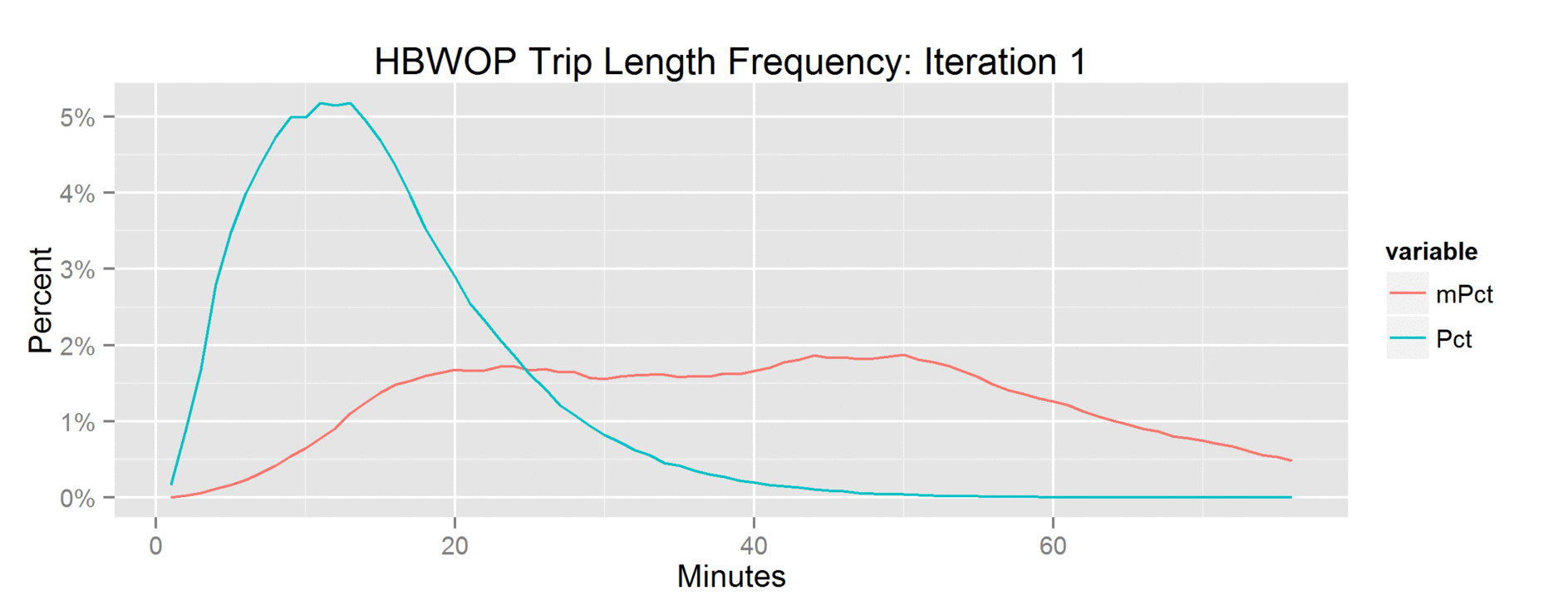
One of the charts. Click for larger and animated.
To do this, you need Imagemagick (scroll down for Windows) and the following command line:
convert -resize 75% TLFHBWOP_Iter%dplot.png[1-30] HBWOP.gif
The resize parameter is optional, I used it to reduce the image size down to something allowable by Twitter.
Tags: gif, imagemagick, R