RMarkdown Reports with Good Looking Tables
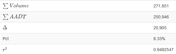
This is how a table should look
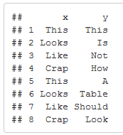
Like it says, this is *not* how a table should look!
It seems to me the only purpose of using RMarkdown is to make nice looking reports from data (and don’t get me wrong, that’s EXTREMELY IMPORTANT – what good is data if it can’t be communicated). Graphics look nice, but sometimes you need to see a table.
Enter two things: kableExtra and LaTeX.
kableExtra is simple to use:
library(kableExtra)

knitr::kable(theTableToShow, "html") %>%

kable_styling(bootstrap_options = c("striped", "hover"))
Yeah, it’s that simple! And there are options, too.
However, using Greek letters is a tad (only a tad) more difficult:
row.names(okisum) = c("Region", "$\\sum Volume$", "$\\sum AADT$", "$\\Delta$", "Pct", "$r^2$")
The “$\sum” refers to the symbols listed on this page (and there’s more, just do a web search for LaTeX Math Symbols and there’s hundreds of guides on what is available). The one change is the extra backslash needed in R to escape the text.
The last part is the text formatting. I did this with the r format command:
format(round(as.numeric(table$AADT), 0), nsmall=0, big.mark=",")

paste(format(round(as.numeric(100 * table$Pct), 2), nsmall=0, big.mark=","), "%", sep="")
Note that this needs to be the last step, since the output of format is text. The first line rounds to no decimal points and adds a comma. The second line rounds 100*percentage to 2 decimal points and pastes a percent sign after it with no separator.
While this may seem menial, I’ve heard of many stories where management/leaders/etc didn’t want to believe something scrawled on a piece of paper, but when the same information was printed nicely on greenbar dot matrix paper, it was accepted as excellent work.


You must be logged in to post a comment.